The Glenlivet is an aged single malt Speyside whisky with an illustrious career stretching back to 19th century Scotland.
The brief
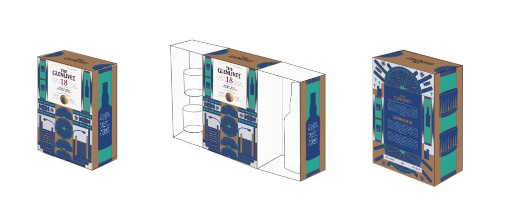
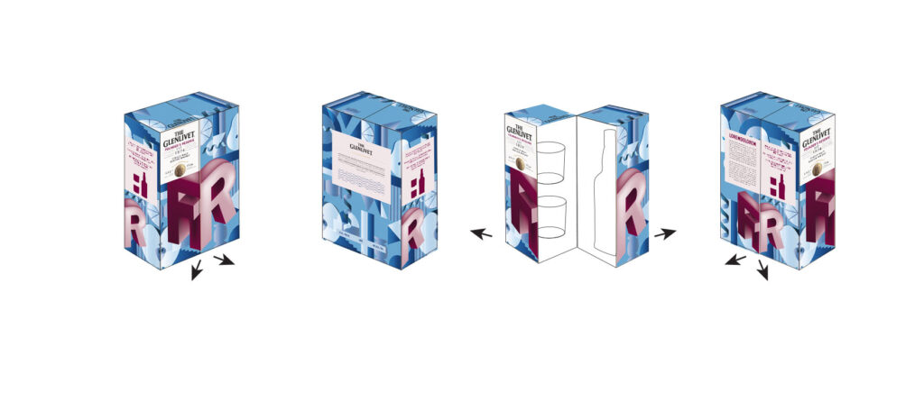
Every year The Glenlivet releases a Value-Added Pack, in time for the festive season. Because the holidays are a busy time for retailers, the aim of this brief was to create a pack that would increase disruption and visibility on the shelf, while also showcasing The Glenlivet’s new corporate identity and colours. The box would need to incorporate a 750ml bottle and two highball glasses.
My role
My role was to create layout designs for the four The Glenlivet variants: Founder’s Reserve, 12 Year Old, 15 Year Old and 18 Year Old. The 18 Year variant is the most premium in this set, and needed to stand out from the other four. This I did with foil embossed panels.
I also had to think about the opening mechanism of the pack, informed by a production team.
The two below options didn’t make it to final production, (there can only be one), but I do feel like they were good options in their own right.
The creative solution
These two options didn’t make it to final production, (there can only be one), but I do feel like they were good options in their own right:
IDEA 1:
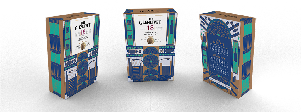
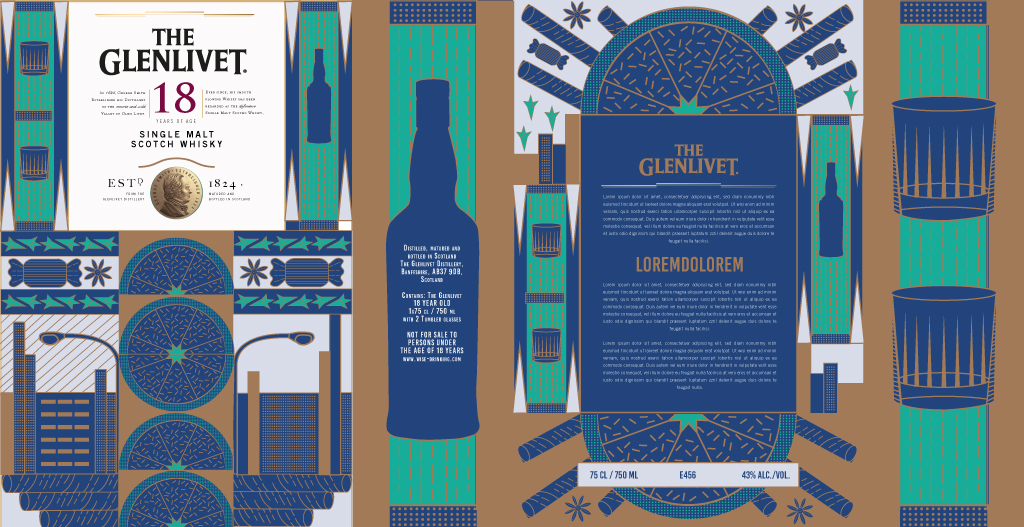
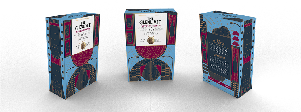
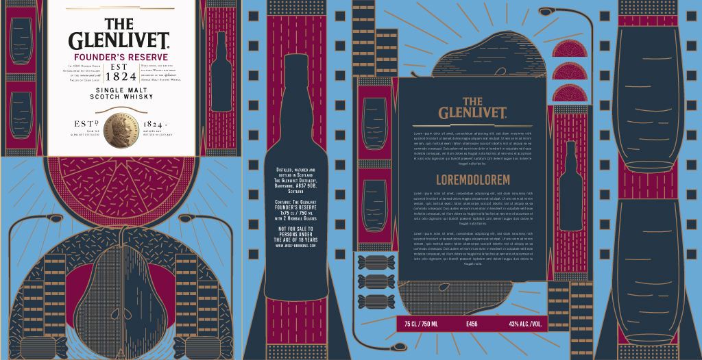
This design utilises illustration, with an Art Deco flair, mimicking the linework style of the Glenlivet curve device. The result is playful and creative while still remaining structured and premium.
Because of the illustration style, this design lends itself to foiling. The tasting notes of the whisky are communicated visually in a refined and pattern-like manner.
Urban elements like buildings, street lamps and glasses to speak to the sophistication of the target audience.
Production | Copper foil debossing on copper linework.
Key words | Sophisticated, playful, cosmopolitan
Option 1 | 18 Year Old Whisky
Option 1 | Founder's Reserve
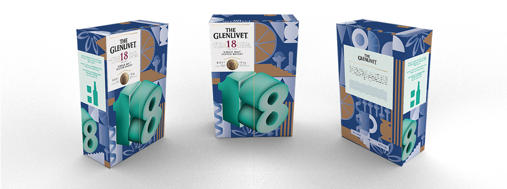
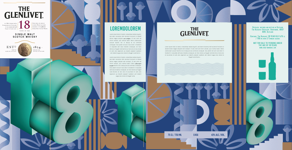
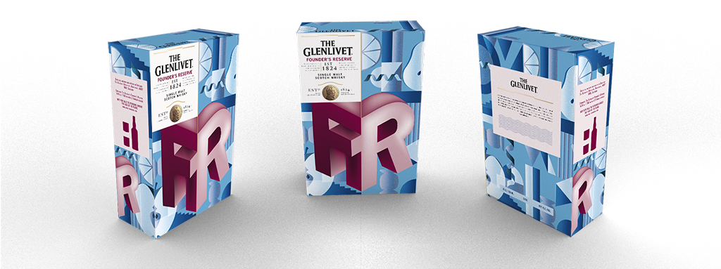
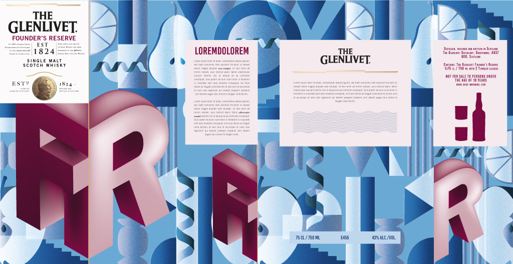
IDEA 2:
Bold typography is a key part of the Glenlivet look and feel and a perfect way to break through the clutter of a busy store shelf. In this pack design, bold typography combines with pattern and a simple two-colour palette to create a striking visual.
Production | Spot UV on main typographic elements.
Key words | Bold, Eyecatching
Option 2 | 18 Year Old Whisky
Option 2 | Founder's Reserve
Credits
Agency: Machine_
Designer & Illustrator: Katya wagner | Creative Group Head: Riaan Strydom | Executive Creative Director: PJ Eales | Account Manager: Vuyelwa Ntshuntshe | Business Unit Director: Alex Forrester